[Gretl-users] Re: Assistance Needed on Scaling Impulse Response in SVEC Model Using "gpbuild"

Thanks for your response, sir.
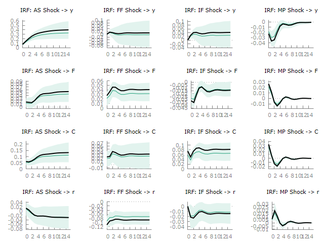
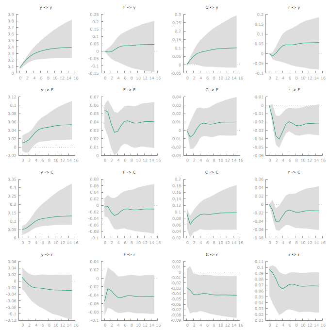
Please take a look at the attached pictures of the impulse response graphs
I generated. The first one, tagged "sample," is generated from the SVEC
model, while the other one is from the normal VEC model. In the first
graph, the figures on the Y axis overlapped for some irf, and I wish they
could appear as neatly displayed as those of the VEC model.
Thanks.
On Fri, 31 Jan 2025 at 19:49, Cottrell, Allin <cottrell(a)wfu.edu> wrote:
On Fri, Jan 31, 2025 at 1:21 PM Olasehinde Timmy
<timmexdareal(a)gmail.com>
wrote:
>
> I am working with the SVEC model and using the "gpbuild" syntax to
generate impulse response functions. However, I am having difficulty
adjusting the scale to make the impulse response plots more visible and
readable. I would appreciate any guidance on how to modify the settings or
apply any specific syntax that can enhance the visualization.
Might be helpful if you could post an example of the type of plot you
mean, plus a brief account of how you'd prefer it to look.
Allin
_______________________________________________
Gretl-users mailing list -- gretl-users(a)gretlml.univpm.it
To unsubscribe send an email to gretl-users-leave(a)gretlml.univpm.it
Website:
https://gretlml.univpm.it/postorius/lists/gretl-users.gretlml.univpm.it/
Attachments:
- attachment.htm (text/html — 2.0 KB)
- sample.png (image/png — 59.3 KB)
- vecm.png (image/png — 72.3 KB)