[Gretl-users] Re: issues with the graph

thanks.
Please see the graph attached.
regards
Theo
On Mon, 10 May 2021 at 15:02, Allin Cottrell <cottrell(a)wfu.edu> wrote:
On Mon, 10 May 2021, Theodoros Panagiotidis wrote:
> Dear Allin,
>
> Thanks for this.
>
> Please find attached the screenshot of the graph and the versions of
gretl
> and gnuplot.
>
> It is not working.
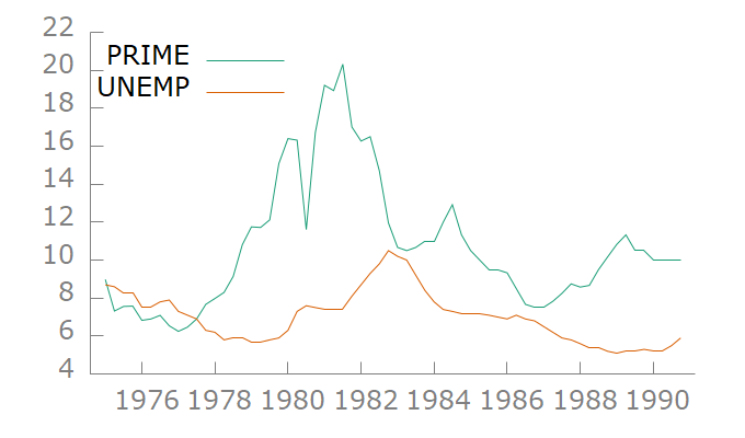
Thanks. I see what you mean! Could I ask you to post an image of a
relatively simple plot that's easy to replicate? For example, use
Ramanathan dataset data9-7 and make a time-series plot of PRIME and
UNEMP "on a single graph". For reference I'm attaching a screenshot
of what I mean.
Allin_______________________________________________
Gretl-users mailing list -- gretl-users(a)gretlml.univpm.it
To unsubscribe send an email to gretl-users-leave(a)gretlml.univpm.it
Website:
https://gretlml.univpm.it/postorius/lists/gretl-users.gretlml.univpm.it/
--
Theodore Panagiotidis
Department of Economics
University of Macedonia
Thessaloniki, Greece
ResearchGate <https://www.researchgate.net/profile/Theodore_Panagiotidis>
Econpapers <https://econpapers.repec.org/RAS/ppa1363.htm>
Attachments:
- attachment.htm (text/html — 2.0 KB)
- gretl5.png (image/png — 24.9 KB)